MA15 is a design studio specialising in brand identity, strategy, and art direction. We craft refined, future-ready brands that balance form with function.
MA15 is a design studio specialising in brand identity, strategy, and art direction. We craft refined, future-ready brands that balance form with function.
MA15 is a design studio specialising in brand identity, strategy, and art direction. We craft refined, future-ready brands that balance form with function.
View Full Project
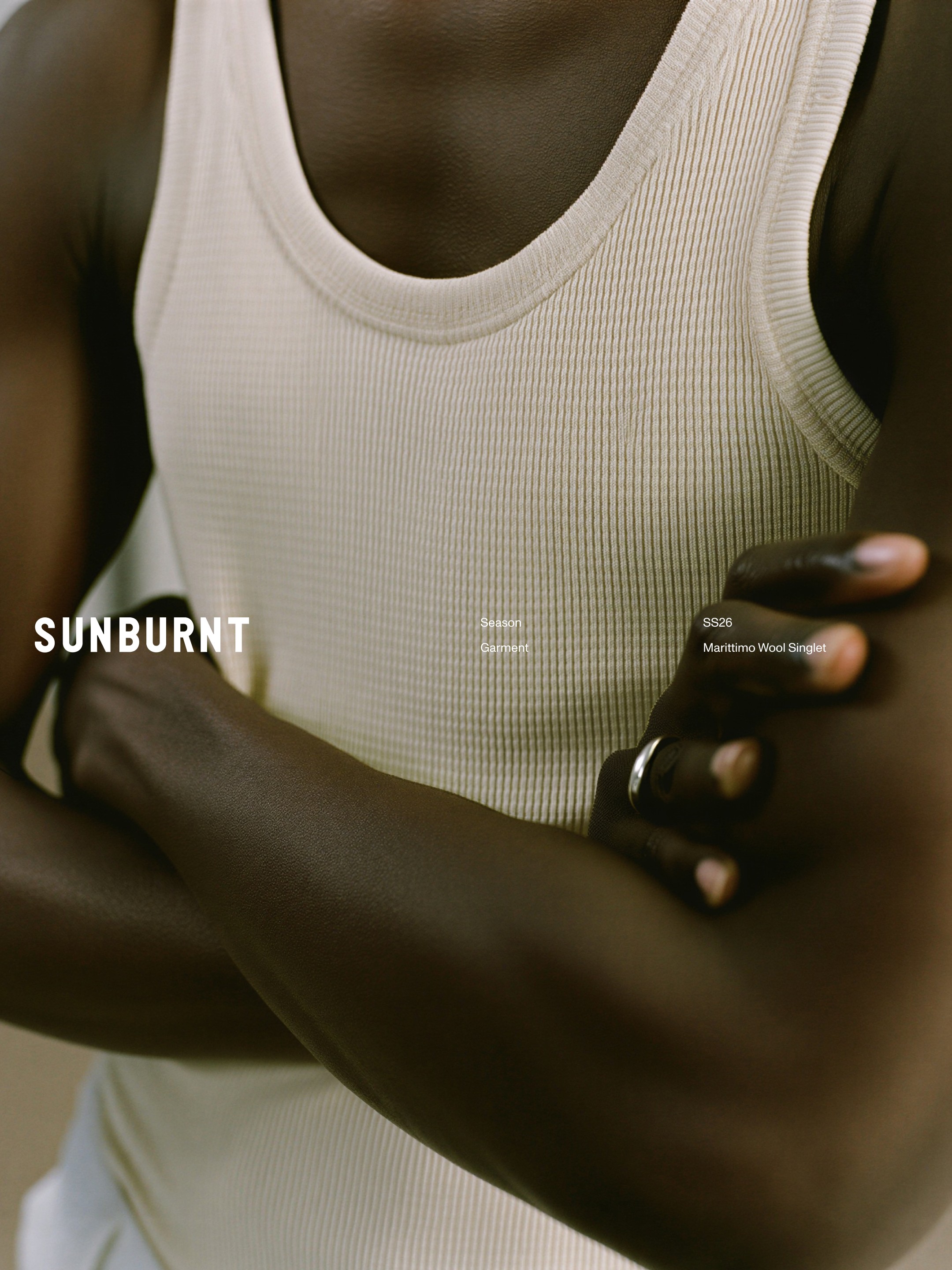
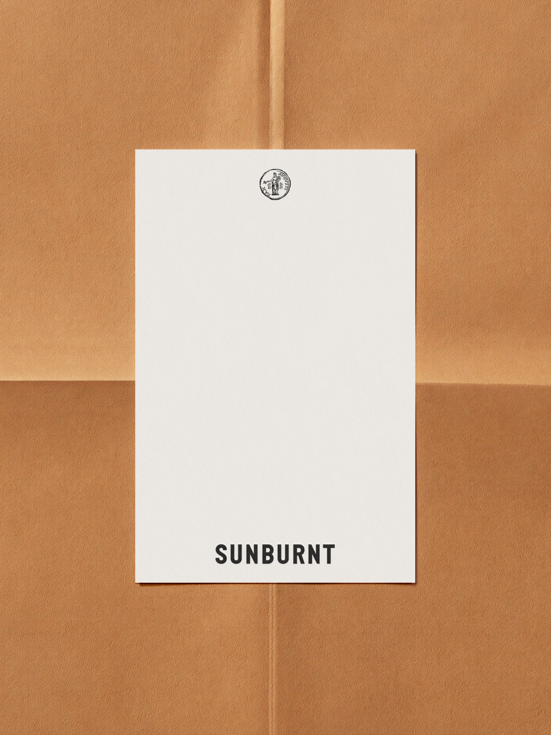
Sunburnt
Identity (More Soon)
Sunburnt is a unisex fashion label designed to be a living expression of life under the Mediterranean sun. Inspired by the season of relaxation, it's stylistic influence is not defined by language or border, but instead borrowed from the mutual cultural heritiage of the Mediterranean sea. To unite this shared maritime culture under a symbol that embodies this shared history, we chose the Roman coin 'Pax Avgvsti', a symbol of peace and prosparity, commonly sea-traded throughout the region for centuries. A mark given as a nod to the provenance of timeless style delivered in a modern contemporary package. Sunburnt exists at the intersection of resortwear, athleisure and classic tailoring, grounded in the belief that the blending of influence sits at the heart of its creative identity.
View Full Project
Em Siostra
Identity
III
V
In early 2024, designer Patrycja Huczek approached us to craft the identity for her upcoming womenswear label, Em Siostra; a brand born at the intersection of her multicultural heritage and the spirit of sisterhood. Together, we explored how to build a contemporary fashion identity that felt deeply personal while standing confidently within the modern designer landscape. Our focus was on closeness and authenticity, steering away from the distant, corporate influenced, impersonal tone of larger fashion houses. The resulting design language acts as a refined frame for Em Siostra’s garments and personality, balancing intimacy with a sense of credibility and depth essential to a brand defined by quality and consideration.


Em Siostra
Identity
In early 2024, designer Patrycja Huczek approached us to craft the identity for her upcoming womenswear label, Em Siostra; a brand born at the intersection of her multicultural heritage and the spirit of sisterhood. Together, we explored how to build a contemporary fashion identity that felt deeply personal while standing confidently within the modern designer landscape. Our focus was on closeness and authenticity, steering away from the distant, corporate influenced, impersonal tone of larger fashion houses. The resulting design language acts as a refined frame for Em Siostra’s garments and personality, balancing intimacy with a sense of credibility and depth essential to a brand defined by quality and consideration.
Em Siostra
Identity
III
V
In early 2024, designer Patrycja Huczek approached us to craft the identity for her upcoming womenswear label, Em Siostra; a brand born at the intersection of her multicultural heritage and the spirit of sisterhood. Together, we explored how to build a contemporary fashion identity that felt deeply personal while standing confidently within the modern designer landscape. Our focus was on closeness and authenticity, steering away from the distant, corporate influenced, impersonal tone of larger fashion houses. The resulting design language acts as a refined frame for Em Siostra’s garments and personality, balancing intimacy with a sense of credibility and depth essential to a brand defined by quality and consideration.
View Full Project
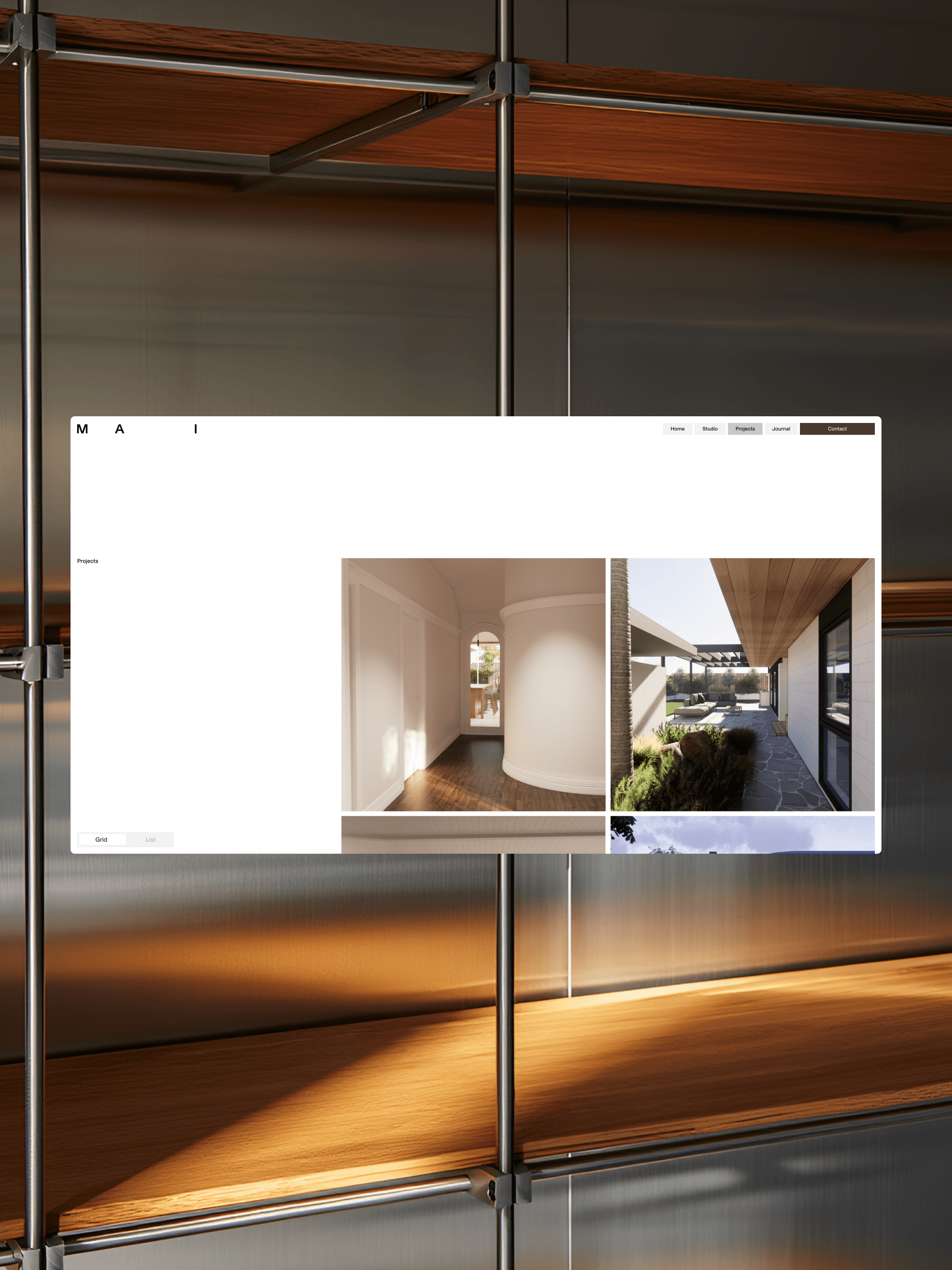
Maglio Architecture + Interiors
Identity, Website
Maglio Architecture + Interiors engaged us to build a brand and digital presence that accurately reflected their practice, not just visually but strategically. From the beginning, our focus extended beyond design. We worked closely with them to develop a full suite of foundational documents, including brand messaging, strategic positioning, and SEO frameworks, to ensure every element of their communication was aligned, consistent, and purposeful. Through the messaging work, we distilled what makes MAI different in a crowded market. Their deep, hands-on background in carpentry informs a practical understanding of construction that most studios cannot offer. This, combined with a genuine commitment to integrity, honesty, transparency, quality, and collaboration, shaped the language and tone of voice we built for the brand. It allowed us to define not only who they are and what they offer, but also how and why they engage with their audience. The strategy documentation focused on how those qualities translate into real-world positioning by identifying their ideal clients, clarifying their point of difference, and mapping out how they interact with potential clients across every stage of a project. This work also guided the structure and content of the website, helping it act as more than a portfolio. It became a tool to educate, build trust, and generate new business. Finally, we developed a detailed SEO framework to ensure the new site was discoverable and competitive. From keyword strategy and page titles to meta descriptions and on-page content recommendations, we built the technical foundation to support long-term growth and visibility. The result is a brand system that is considered from every angle, including strategy, language, design, and digital performance, and a website that feels true to MAI’s character: clear, approachable, and deeply grounded in the craft of architecture and building.
View Full Project
Republic Economica
Identity
III
V
Once a long-standing South Yarra institution, Café Republic was reimagined when its owners, Welcommé Group, approached us with a bold vision for change. In response to tightening consumer spending, they chose to burn the old brand to the ground and let Republic Economica rise from the ashes. A price-concious, late-night alfreso phoenix for the people with a mission to become the suburb’s recession-era saviour. We built a brand that doesn’t take itself too seriously, designed to be championed by it's devoted disciples of good times. Originally conceived as a temporary project on a tight timeline, Republic Economica has proven too powerful to fade, and it’s here to stay, no matter the market.


Republic Economica
Identity
Once a long-standing South Yarra institution, Café Republic was reimagined when its owners, Welcommé Group, approached us with a bold vision for change. In response to tightening consumer spending, they chose to burn the old brand to the ground and let Republic Economica rise from the ashes. A price-concious, late-night alfreso phoenix for the people with a mission to become the suburb’s recession-era saviour. We built a brand that doesn’t take itself too seriously, designed to be championed by it's devoted disciples of good times. Originally conceived as a temporary project on a tight timeline, Republic Economica has proven too powerful to fade, and it’s here to stay, no matter the market.
Republic Economica
Identity
III
V
Once a long-standing South Yarra institution, Café Republic was reimagined when its owners, Welcommé Group, approached us with a bold vision for change. In response to tightening consumer spending, they chose to burn the old brand to the ground and let Republic Economica rise from the ashes. A price-concious, late-night alfreso phoenix for the people with a mission to become the suburb’s recession-era saviour. We built a brand that doesn’t take itself too seriously, designed to be championed by it's devoted disciples of good times. Originally conceived as a temporary project on a tight timeline, Republic Economica has proven too powerful to fade, and it’s here to stay, no matter the market.
View Full Project
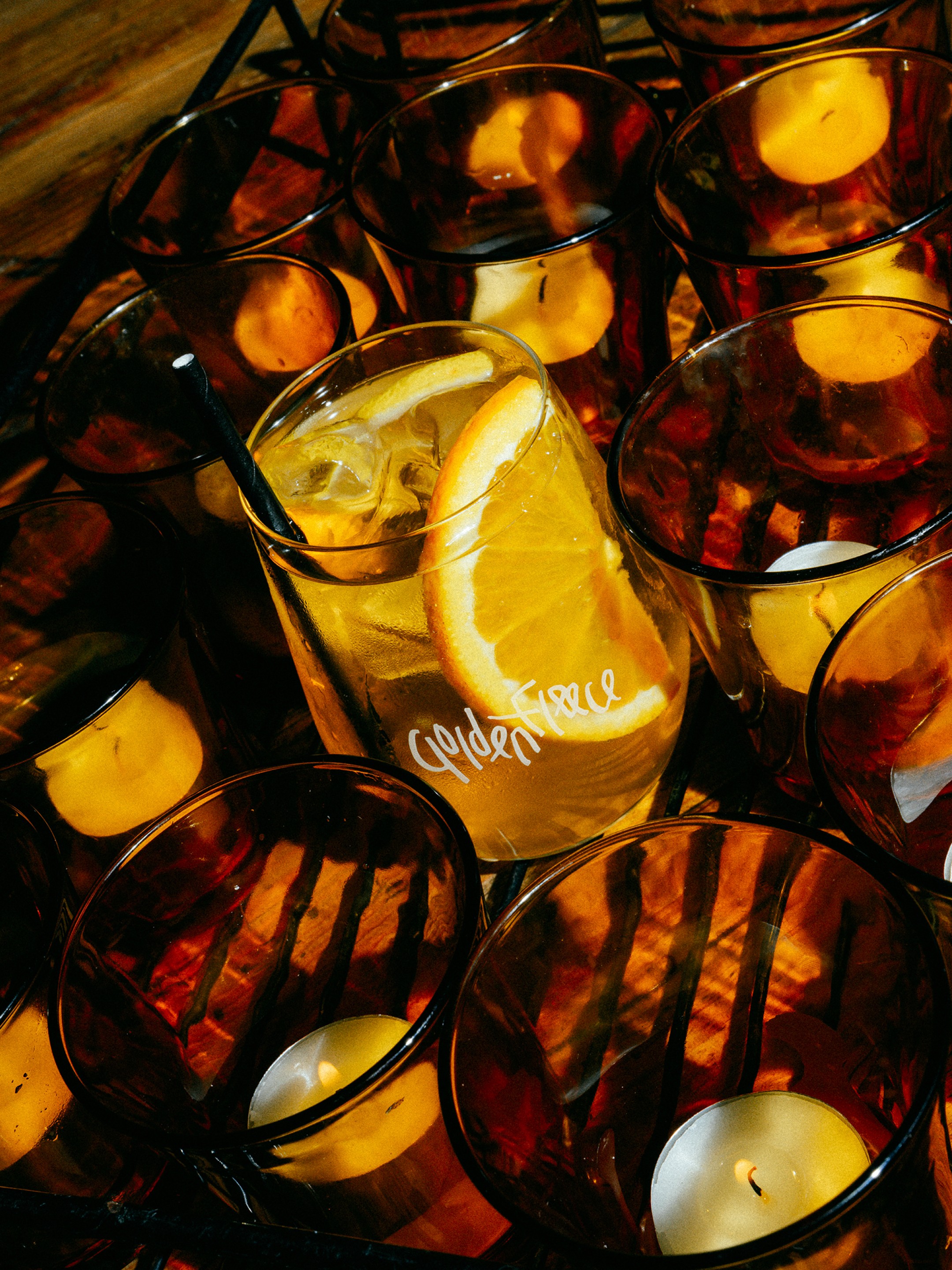
Golden Fleece
Identity
Welcommé Group approached us in late 2023 to rebrand their venue, Golden Fleece Hotel, citing a disconnect between its vibrant personality and a then-existing punk-inspired identity. Drawing on the venue’s neo-Santorinian curves, its iconic yucca and cacti-lined rooftop, and its unmistakable Greek DNA, we set out to unify every touchpoint into a brand that finally felt cohesive and complete. The result is an identity that’s balanced, characterful, and true; a reflection of the venue’s spirit, its colourful community, its Hellenic heritage, and its mission to deliver a distinctive brand of immersive, thematic hospitality.
View Full Project
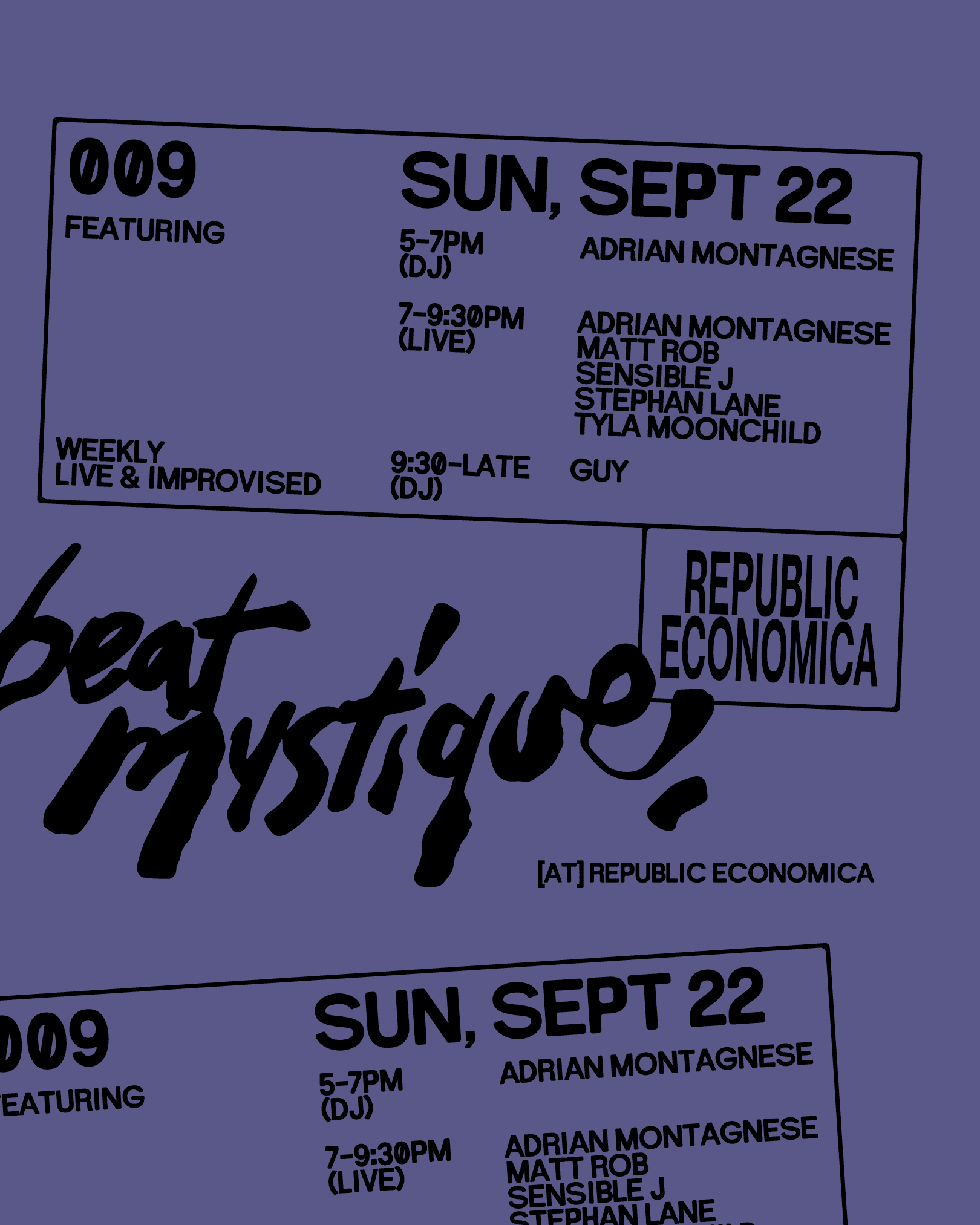
Beat Mystique
Identity
III
V
A live jazz and slow jams event brand. Inspired by nightclub stamps and the dynamism of improvisational jazz, this logo and poster system play on the chaos of in-the-round performances observed from close quarters. A brand not defined by location or genre, we wanted to provide a mark that felt rich with spontaneity while being unmistakable in a busy crowd.


Beat Mystique
Identity
A live jazz and slow jams event brand. Inspired by nightclub stamps and the dynamism of improvisational jazz, this logo and poster system play on the chaos of in-the-round performances observed from close quarters. A brand not defined by location or genre, we wanted to provide a mark that felt rich with spontaneity while being unmistakable in a busy crowd.
Beat Mystique
Identity
III
V
A live jazz and slow jams event brand. Inspired by nightclub stamps and the dynamism of improvisational jazz, this logo and poster system play on the chaos of in-the-round performances observed from close quarters. A brand not defined by location or genre, we wanted to provide a mark that felt rich with spontaneity while being unmistakable in a busy crowd.
View Full Project
Viino
Packaging
Our good friends at Viino were seeking a more cohesive identity for their line of viral wines, which first gained popularity in inner-city Melbourne during the Covid-19 lockdowns. As the world reopened, they had outgrown their home-delivery roots and needed a design system that felt more consistent, alive and mature, without losing the irreverent charm that made the brand resonate. Collaborating with illustrator Daisy Watson, we developed a single wrap-around label adaptable across varietals and future releases. Contemporary in tone, the design balances rigid and curvilinear elements across three distinct panels, creating a duo-toned landscape of warmth and invitation. For their first orange wine, we leaned into the spirit of summer occasions with a palette of vibrant red and yellow, a visual cue to a product best enjoyed outdoors, shared among friends.
View Full Project

Arrange Fabrics
(Coming Soon)
This project is yet to be officially released. More information soon 👁️
Arrange Fabrics
(Coming Soon)
III
V
This project is yet to be officially released. More information soon 👁️
View Full Project

Checker
(Coming Soon)
This project is yet to be officially released. More information soon 🏁
Checker
(Coming Soon)
III
V